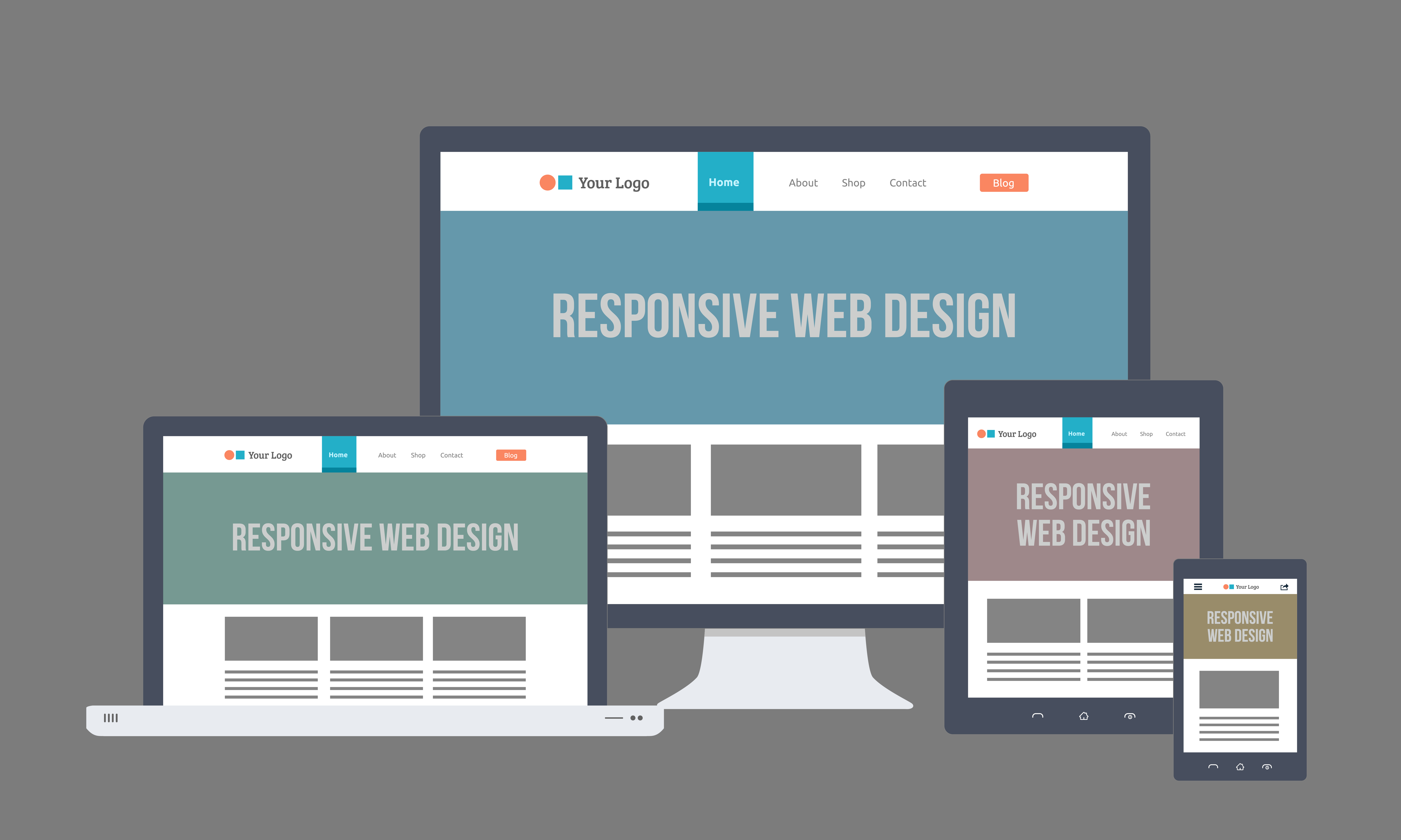
The Evolution of Responsive Web Design: From Fixed to Fluid
The journey of responsive web design began in the early 2000s with the rise of mobile devices and the need for websites to adapt to varying screen sizes. Initially, websites were built using fixed layouts, which meant that they displayed the same way regardless of the device being used. This approach proved to be limiting, as users found it difficult to navigate and consume content on smaller screens. As a response to this challenge, designers began exploring fluid grid systems that allowed for more flexible layouts, enabling sites to adjust their configuration based on the screen resolution and orientation.
As technology advanced and user behaviors evolved, the fluid design philosophy paved the way for the responsive design breakthrough in the late 2010s. This approach emphasized the importance of media queries and flexible images, ensuring that websites could seamlessly transition between desktops, tablets, and smartphones. Today, responsive web design is not just a trend but a fundamental practice, as it enhances user experience, improves SEO rankings, and caters to the growing demand for accessibility across all devices. The evolution from fixed to fluid exemplifies how adaptation to user needs and technological advancements shapes the web landscape.
Top 5 Principles of Effective Responsive Web Design
In today's digital landscape, ensuring a seamless user experience across all devices is crucial. One of the top principles of effective responsive web design is the use of flexible grids. This approach allows layouts to reshape and resize based on the screen size, providing a tailored experience for each user. Additionally, media queries play an essential role in responsive design by enabling the application of different styles for various devices, thus enhancing accessibility and usability.
Another fundamental principle is the adoption of fluid images and scalable media. Images should be able to scale according to the screen size without losing quality or causing layout disruptions. This can be achieved by using CSS properties such as max-width and height. Furthermore, prioritizing content hierarchy is vital; ensuring that the most important content is easily accessible regardless of the device makes the user experience more engaging. By implementing these principles, you can create a responsive design that is both functional and visually appealing.
How Does Responsive Web Design Enhance User Experience?
Responsive web design plays a crucial role in enhancing user experience by ensuring that websites adapt seamlessly to various screen sizes and devices. This approach not only improves accessibility for users on smartphones and tablets but also encourages longer engagement times. When a website is responsive, visitors can easily navigate and interact with the content, leading to a more satisfying browsing experience. As a result, businesses can expect lower bounce rates and higher conversion rates, as users are more likely to stay on a site that offers a fluid and intuitive layout.
Additionally, a well-implemented responsive design can positively impact a website's search engine ranking. Search engines prioritize sites that offer a good user experience, and responsive design is a key factor in this equation. By providing a consistent and efficient interface across all devices, websites not only retain their audience but also gain favor from search algorithms. In essence, responsive web design is not just a technical necessity; it is a strategic advantage that ensures users enjoy a cohesive experience, regardless of how they access the site.