Essential Web Development Tools Every Beginner Should Know
For beginners diving into the world of web development, understanding the essential tools can significantly streamline the learning process and enhance productivity. First on the list is Visual Studio Code, a powerful and flexible code editor that offers a wealth of features tailored for web developers. Its vast collection of extensions allows users to customize their experience, enabling support for numerous programming languages. Additionally, using W3Schools for HTML and CSS basics can provide a solid foundation to build upon.
Another vital tool is the Chrome Developer Tools, which gives developers real-time insight into how their web pages behave. These tools allow for efficient debugging and performance optimization, essential skills for any web developer. Alongside these, learning version control systems like Git is crucial, especially when collaborating on projects. Platforms such as GitHub not only host code repositories but also facilitate collaboration and project management, making them indispensable for modern web development.
How to Balance Functionality and Aesthetics in Web Design
Balancing functionality and aesthetics in web design is crucial for creating an engaging user experience. Functionality ensures that the website operates smoothly and meets the needs of its users, while aesthetics draw visitors in and create a positive emotional response. To achieve this balance, designers can follow these key principles:
- Prioritize Usability: Ensure that navigation is intuitive and that users can easily find what they're looking for.
- Visual Hierarchy: Use size, color, and spacing to guide users' attention to the most important elements of the site.
- Responsive Design: Optimize the website for different devices, providing a consistent experience across desktops, tablets, and smartphones.
Incorporating these principles can significantly improve both the functionality and aesthetics of your web design. Moreover, utilizing resources such as Smashing Magazine can provide valuable insights into achieving this balance. Remember, effective web design is about creating a seamless experience that aligns with your brand identity while also delivering practical usability to your audience. For further exploration of design theories, consult Nielsen Norman Group for professional guidelines.
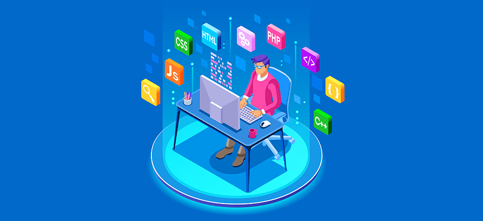
What Are the Key Programming Languages for Web Development Today?
In today's digital landscape, web development heavily relies on a select few programming languages that enable developers to create dynamic and responsive websites. The most prominent of these are JavaScript, PHP, and Python. Each of these languages serves unique purposes, such as enhancing user interactivity, managing server-side operations, or processing data efficiently. JavaScript, in particular, is essential for front-end development, allowing developers to bring websites to life with interactive elements.
On the back end, PHP is widely used for web server programming, particularly for constructing custom applications and content management systems. It's an excellent choice for developers looking to manage databases and facilitate user authentication. Meanwhile, Python has rapidly gained traction among web developers due to its simplicity and readability. Its frameworks, like Django and Flask, make it easier than ever to build robust web applications. The combination of these languages equips developers with the tools needed to tackle various web development challenges effectively.