Hydra Tech Insights
Stay updated with the latest in technology and gaming.
Responsive Web Design: The Charm of Fluid Layouts
Discover the magic of fluid layouts in responsive web design! Unlock stunning websites that adapt seamlessly to any device.
Understanding Fluid Layouts: How Responsive Web Design Transforms User Experience
Understanding fluid layouts is essential for web designers looking to create responsive web pages that adapt seamlessly to various screen sizes. Unlike fixed layouts that confine content to specific pixel widths, fluid layouts use relative units such as percentages and ems to ensure that elements resize and reposition based on the viewer's device. This adaptability not only enhances the aesthetic appeal of a website but also significantly improves user experience, as users can easily navigate and interact with content, regardless of their device.
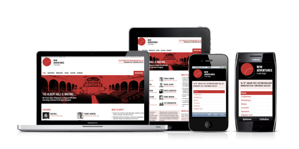
Implementing a fluid layout is a crucial aspect of responsive web design, which focuses on providing an optimal viewing experience across a broad range of devices, from desktops to smartphones. According to W3Schools, responsive design combines flexible grids and media queries to adjust a website’s appearance dynamically. When users encounter a site that effortlessly adjusts to their screen size, they are likely to stay longer and engage more deeply with the content, significantly boosting site retention and lowering bounce rates.

10 Key Benefits of Implementing Responsive Web Design for Your Website
Implementing responsive web design (RWD) is essential in today’s digital landscape, where users access websites from a myriad of devices. One of the key benefits is improved user experience; a responsive website adapts its layout and content to fit any screen size, enhancing usability. According to Smashing Magazine, this seamless experience not only keeps visitors engaged but also reduces bounce rates, where users leave the site quickly due to poor navigation. A well-structured responsive design fosters greater intimacy, making users more likely to return to your site.
Another significant advantage of adopting responsive web design is enhanced SEO performance. Search engines like Google prioritize mobile-friendly sites in their search results, meaning responsive designs can lead to higher rankings. A study by Search Engine Journal highlights that sites optimized for both desktop and mobile platforms will see increased visibility and traffic. Additionally, having a single URL for your content—regardless of the device—simplifies the indexing process for search engines, ultimately boosting your online presence.
Is Your Website Truly Responsive? Common Pitfalls and How to Avoid Them
When it comes to assessing whether your website is truly responsive, many users overlook common pitfalls that can affect user experience. One major issue is the failure to properly scale images and media for different devices. If images aren't optimized, they can slow down load times on mobile devices, creating frustration for users. Additionally, ensure that your navigation is easy to use on smaller screens. A complex navigation menu can alienate visitors; instead, consider using a hamburger menu that’s more suited for smaller display sizes.
Another common pitfall is not testing your website's responsiveness across various devices and screen sizes. Tools like BrowserStack or Responsive Design Mode allow you to view how your site appears on different platforms without needing the physical devices. Furthermore, don't forget to check the loading speed on mobile devices; a speedy site can significantly enhance your SEO rankings and user satisfaction. By regularly reviewing these aspects, you can ensure that your website remains truly responsive and user-friendly.