Hydra Tech Insights
Stay updated with the latest in technology and gaming.
Typography Tango: Dancing with Fonts on the Web
Unleash your creativity with Typography Tango! Discover how to dance with fonts and elevate your web design to new heights.
Exploring the Art of Web Typography: Best Practices and Trends
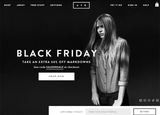
Web typography is a vital aspect of web design that significantly influences user experience and engagement. The way text is presented on a website can enhance readability and overall aesthetic appeal. To achieve effective web typography, it is essential to consider several best practices: use a limited number of fonts, maintain adequate line spacing and letter spacing, and choose font sizes that are accessible on all devices. Additionally, utilizing a cohesive color scheme for text can help improve visibility and comprehension, reinforcing the importance of typographic hierarchy in guiding the user's eye.
As we dive deeper into the realm of typographic trends, it's evident that modern web design leans towards more dynamic and creative solutions. For instance, the rise of variable fonts allows designers more flexibility, enabling smoother transitions between different styles and weights. Furthermore, the integration of responsive typography ensures that text is not only visually appealing but also adapts to various screen sizes. Staying updated on these evolving trends is key for designers wishing to create impactful user experiences and maintain a competitive edge in the digital landscape.

How to Choose the Perfect Font Pairings for Your Website
Choosing the perfect font pairings for your website is crucial for enhancing readability and conveying your brand's personality. Start by understanding the basic principles of typography: contrast, harmony, and hierarchy. A good rule of thumb is to pair a serif font with a sans-serif font to create visual interest. For example, you might use a classic serif font like Georgia for headings and a clean sans-serif font like Arial for body text. This creates a pleasing contrast and helps guide readers' eyes through your content.
When choosing fonts, consider your target audience and the overall mood of your website. Use tools like FontPair to explore different font combinations that work well together. It's also essential to limit your font usage to 2-3 variations to maintain coherence. Experiment with different styles, weights, and sizes to find a pairing that not only looks great but also reflects your brand's identity. Always preview your font choices on various devices to ensure they remain legible and aesthetically pleasing across all platforms. Remember, the right font pairing can enhance user experience and greatly impact your site’s SEO performance.
The Impact of Typography on User Experience: What You Need to Know
Typography plays a pivotal role in shaping the overall user experience on any digital platform. The choice of font, size, spacing, and alignment can significantly influence how easily information is consumed and understood. For instance, studies have shown that well-chosen typography can enhance readability by up to 30%, making it easier for users to navigate through content. A combination of typographic hierarchy and appropriate line height creates a visual structure that guides users' eyes, allowing them to absorb information efficiently.
Moreover, the emotional response triggered by typography should not be underestimated. Different typefaces can evoke specific feelings and perceptions, affecting how users relate to the content. For example, a modern sans-serif font might convey a sense of cleanliness and simplicity, while a serif font may impart a feeling of tradition and reliability. According to Nielsen Norman Group, the appropriate use of typography not only enhances the aesthetic appeal of a website but also builds trust and credibility with users, ultimately leading to better engagement and conversion rates.